In this blog I am going to explain about new Bootstrap version that is Bootstrap v4.0.0-beta.2.
At first I am going to tell what is Bootstrap and what for this is used. Bootstrap is basically a css framework i.e. front-end component library which build responsive, mobile-first projects on the web.
It is also an open source toolkit for developing with HTML, CSS, and JS to build entire app with our Sass variables and mixins, responsive grid system, extensive prebuilt components, and powerful plugins built on jQuery.
The new Bootstrap beta version is almost complete version for usage and it’s components that need Popper.js as dependency.
It is required as because
- Tooltips rely on the 3rd party library Popper.js for positioning.
- Popovers rely on the 3rd party library Popper.js for positioning.
- Dropdowns are built on a third party library, Popper.js, which provides dynamic positioning and viewport detection.
So these are the Bootstrap 4 components that need Popper.js.
Though Popper.js is stated as required for Bootstrap 4, and Bootstrap 4 JS logs an error if it can’t find Popper, you can still use Bootstrap 4 JS without Popper, if you don’t need tooltips, popovers nor dropdowns and Bootstrap modals also require Popper.js.
Grid System
Bootstrap’s grid system uses a series of containers, rows, and columns to layout and align content. It’s built with flexbox and is fully responsive. Below is an example and an in-depth look at how the grid comes together.
The above example creates three equal-width columns on small, medium, large, and extra large devices using our predefined grid classes. Those columns are centered in the page with the parent .container. This is called flexbox design.
While Bootstrap uses ems or rems for defining most sizes, pxs are used for grid breakpoints and container widths. This is because the viewport width is in pixels and does not change with the font size.
See how aspects of the Bootstrap grid system work across multiple devices with a handy table.
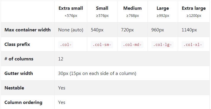
Here –xs- class is deleted and new –xl- class has been added for extra large screens.
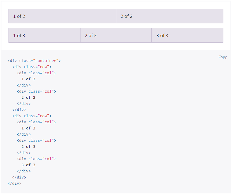
Auto width with columns with equal width
For example, here are two grid layouts that apply to every device and viewport, from xsto xl. Add any number of unit-less classes for each breakpoint you need and every column will be the same width.
Cards
Cards replace Bootstrap 3’s old panels and wells. Cards are defined as a flexible and extensible content container. It includes options for headers and footers, a wide variety of content, contextual background colors, and powerful display options.
They’re essentially individual content blocks with a ton of out-of-the-box options.
The big thing to take away here is you get a ton of new component options to basically build these little card blocks however you want.
This works both with Flexbox and the default grid mode. If you’re using Flex Box, the cards are built using Flex Box properties. If you’re using the default grid, they’re actually using a CSS trick to avoid the need for JS. The container uses display: table; and each “card” is display: table-cell; making it have table properties (aka, equal column heights).
New Reset Component called Reboot.css
Previously, Bootstrap used Normalize.css as its CSS reset. Normalize is awesome and well-respected. With Bootstrap 4, they actually just take normalize.css, and add some Bootstrap things to it.
In layman’s terms, they combined their reset and base styles into a single file. This is useful because eventually you could essentially use just reboot.css on it’s own.
Sass Variables for Customizing
Everything with Bootstrap 4 is about customizing – maybe more than any other version before. They’ve consolidated all the variable options to a single file where you can compile your Sass on the fly and with little effort. This used be all previously done in a separate style sheet.
There’s also a bunch of brand new customization options. They may streamline the process further to a different file.
You can custom things like:
- Colors
- Options (Flex Box, transitions, rounded, shadows, etc.)
- Spacing
- Body (defaults)
- Link Styles
- Grid Breakpoints
- Grid Containers
- Grid Columns
- Typography
- Components
- Tables
- And more…
Dropped IE8 Support
IE8 support was dropped. Dropping support for IE8 means we can take advantage of the best parts of CSS without being held back with CSS hacks or fallbacks. It also means that the maintainers can focus on new technologies and pushing forward.
It’s currently unclear if there will be a partial support with a HTML5 shiv and respond.js or not. It seems though that if you need Internet Explorer 8 support, you’ll have to stick to using Bootstrap 3.
Inverse Tables
Tables now have an added table-inverse class for having another variation of a table. It’s definitely a nice to have.
New Outline Buttons
Bootstrap 4 has added some new button styles with “Outline Buttons”. Outline Buttons appear hollow or are simply inverses of a regular button.
The classes for them are:
Primary
Secondary
Success
Warning
Danger
Glyphicons are dropped
Bootstrap 4 also dropped Glyphicon support. And recommended for using FontAwesome
Introduces new Spacing Utility Classes
Another cool feature that was added is spacing utility classes. Spacing utility classes allow you to quickly add spacing in any direction via margin or padding using a utility class.
For Margin or Padding use:
- “m” for margin
- “p” for padding
For direction, you can use:
- “a” for all
- “t” for top
- “r” for right
- “l” for left
- “x” for left and right
- “y” for top and bottom
For sizes, you can use:
- “0” for zero
- Leave Blank for default
- “auto” for Auto
- “md” for Medium
- “lg” for Large
Example :
<div class=”w-100″></div> = The div width is 100%
<div class=”mr-3”></div> = margin right is 1 rem i.e. 16px
<div class=”mt-3”></div> = margin top is 0
<div class=”bg-light”></div> = Backgrounf color is light grey
And much more..
You can check and explore the whole Bootstrap docs for more on http://getbootstrap.com/
Please share if you like it!
Follow me on LinkedIn
By profession I am a Frontend Developer at Openweb Solutions.