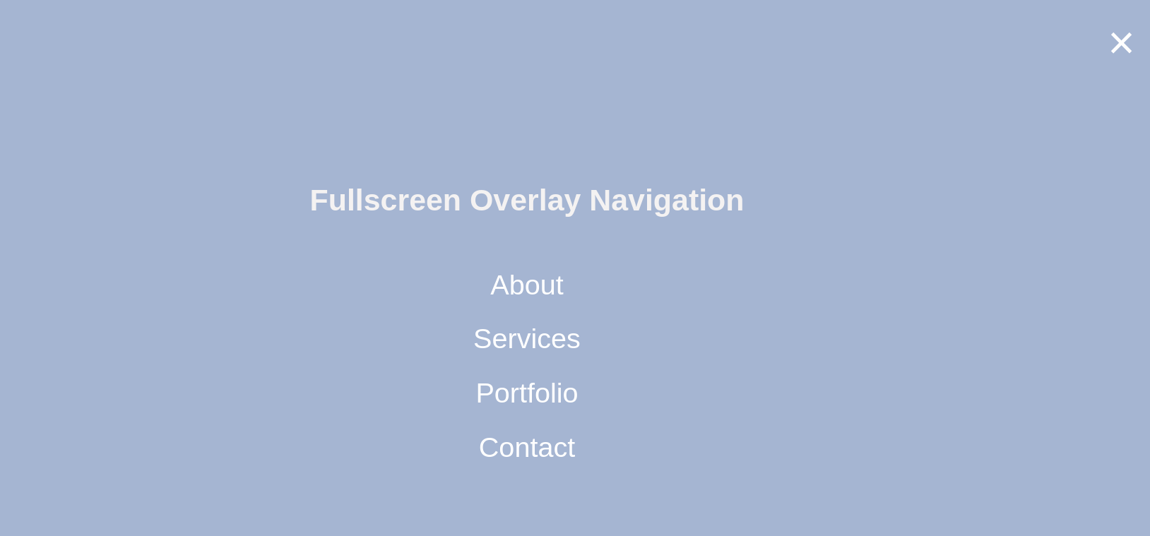
Using JavaScript and CSS properties we can create stylish fullscreen overlay navigation with a hamburger toggle button. This navigation menu will appear when toggled. Besides, the overlay covers the whole screen and makes lots of space for menu items. Similarly, there are several ways to create this type of navigation. In this blog, I am showing two different types of
fullscreen overlay navigation:
1) The overlay navigation menu from left to right and
2) The overlay navigation menu downwards from the top.
Let’s start with the following structure:
1) From left to right
HTML
<!-- The overlay -->
<div id="myNavigation" class="overlay">
<!--To close the overlay navigation -->
<a href="javascript:void(0)" class="closebtn" onclick="closeNav()">×</a>
<div class="overlay-content">
<a href="#">About</a>
<a href="#">Services</a>
<a href="#">Portfolio</a>
<a href="#">Contact</a>
</div>
</div>
<!-- To open/show the overlay navigation menu -->
<span style="font-size:30px;cursor:pointer" onclick="openNav()">☰ </span>
CSS
    /* The Overlay (background) */
    .overlay {
     height: 100%;
     width: 0;
     position: fixed;
     z-index: 1;
     left: 0;
     top: 0;
     background-color:rgb(159, 183, 212);
     overflow-x: hidden; /* Disable horizontal scroll */
     transition: 0.5s;
    }

  /* Position the content inside the overlay */
   .overlay-content {
     position: relative;
     top: 25%;
     width: 100%;
     text-align: center;
     margin-top: 30px;
    }

     /* The navigation links inside the overlay */
   .overlay a {
     padding: 8px;
     text-decoration: none;
     font-size: 36px;
     color: #fff;
     display: block;
     transition: 0.3s;
    }

    /* When mouse over the navigation links, change their color */
   .overlay a:hover, .overlay a:focus {
     color: #000;
    }

   /* Position the close button (top right corner) */
   .overlay .closebtn {
     position: absolute;
     top: 20px;
     right: 45px;
     font-size: 60px;
    }


   JAVASCRIPT

    function openNav() {
     document.getElementById("myNav").style.width = "100%";
    }

   /* Close when someone clicks on the "x" symbol inside the overlay */
   function closeNav() {
    document.getElementById("myNav").style.width = "0%";
   }
2) Downwards from the top
Here CSS is little bit different from the one above. Default width is now 100% and height is 0 and overflow-y is hidden.
CSS
   .overlay {
    height: 0;
    width: 100%;
    position: fixed;
    z-index: 1;
    left: 0;
    top: 0;
    background-color:rgb(159, 183, 212);
    overflow-y hidden;
    transition: 0.5s;
   }

   JAVASCRIPT

    function openNav() {
     document.getElementById("myNav").style.height = "100%";
    }

    function closeNav() {
     document.getElementById("myNav").style.height = "0%";
    }
This is one of the simplest ways of Overlay Navigation. I’ll show more design on this type of navigation menu shortly.
Munmun Das
Subscriber
Front-end Developer and Technology Enthusiast at Openweb Solutions